How to create your own Covid-19 dashboard using Tableau
What is Tableau?
Tableau makes it easier to create visual analytics and reports in the form of dashboards. These dashboards can get updated in various time intervals. It enables real business users to finally easily digest data related to their business process.
THE MAIN BENEFIT OF TABLEAU IS THAT IT PROVIDES INSIGHT TO DRIVE BUSINESS DECISION.
What is Tableau used for?
- Tableau is used to translate database queries into beautiful visualizations for your business user.
- Tableau imports data of all sizes and levels.
- Tableau is great for non technical users as there is little code required to create dashboards.
Why should I use Tableau?
- Real time analysis
- Can cater for big data sets
- Can report on data from different sources
- The front runner in data visualization which is a major selling point especially on your resume
What I will build on Tableau
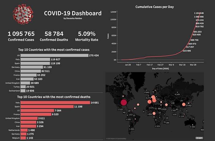
- A dashboard showing the COVID-19 cases growing per day
- It will include a map showing countries with the most infections
- I will publish this to Tableau Public and be able to share the link to anyone!

What will you need?
- A Computer with internet connection
- Install Tableau (IT’S A FREE 14 DAY TRIAL) — https://www.tableau.com/products/trial
- Sign up to Tableau public — https://public.tableau.com/
Design your own COVID-19 dashboard! (Steps)
- Connect to the COVID-19 Data Source by the EU Open Data Portal https://data.europa.eu/euodp/en/data/dataset/covid-19-coronavirusdata/resource/260bbbde-2316-40eb-aec3-7cd7bfc2f590
- Copy the link for the csv: https://opendata.ecdc.europa.eu/covid19/casedistribution/csv
- Open a google sheet (make sure you’re signed in)
- One the first cell type =INPORTDATA(“https://opendata.ecdc.europa.eu/covid19/casedistribution/csv”)
- Wait a bit to load
- Save the sheet as “COVID-19 Datasource”
- Click on “Share” and copy the link
- Save the picture of the Coronavirus somewhere on your computer https://fems-microbiology.org/wp-content/uploads/2020/03/2019-nCoV-CDC23312_without_background-pubic-domain.png
- Make sure you authenticate Tableau in your browser and sign in via a google account.
- Create a Free Tableau Public account (go to https://public.tableau.com/)
- When you’re done with your dashboard click on “Server” and publish to Tableau Public.
Some pointers
- Mortality rate = 𝑆𝑈𝑀(𝐷𝑒𝑎𝑡ℎ𝑠) /𝑆𝑈𝑀(𝐶𝑎𝑠𝑒𝑠)
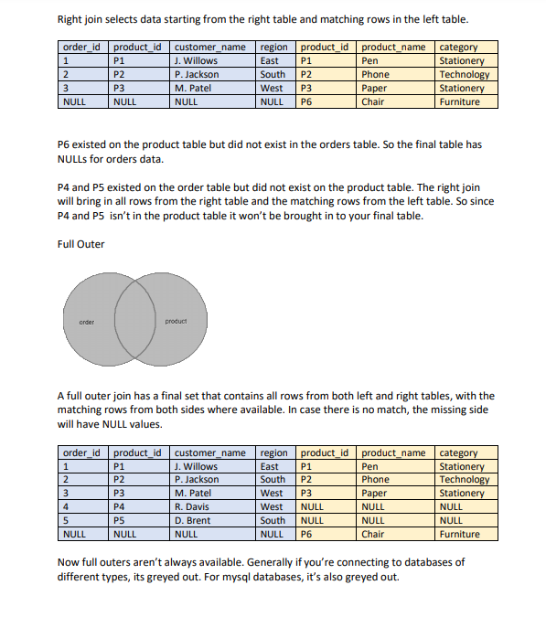
Tableau Joins
Joins are very important in data analysis in general


If you want more detailed information (with videos) to make this Covid-19 Dashboard please contact me.-rajithkalindaa@gmail.com
- You have now created your first Tableau Dashboard and begun your journey towards bringing data to life and sharing your work on the Web. You can see your dashboard online in your Tableau Public Account (as below) -https://public.tableau.com/profile/rajith.kalinda#!/vizhome/COVID-19DashboardbyRajithAmarasinghe/COVID-19Dashboard

The most powerful part
Interactive filters are the most powerful part of Tableau. Users can filter your Dashboard based on clicking any of the other fields in the dashboard (this has to be set up before publishing the dashboard). This interactive nature is arguably one of the most powerful features of this Business Intelligence Tool.
